Data connection with
Excel
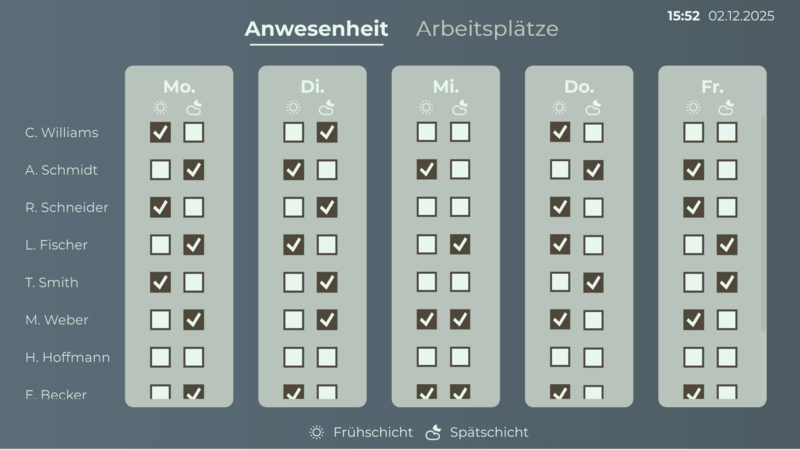
- Real-Time Visualization: Show your Excel data automatically updated on appealing dashboards — ideal for up-to-date key figures and quick decisions.
- Intuitive operation: Connect Excel files via drag & drop and visualize them without programming knowledge — directly in Peakboard Designer.
- Flexible data integration: Combine Excel data with other sources (such as SQL, REST, SharePoint) and create interactive visualizations that are perfect for your day-to-day work.





Your Excel data, live and visually in a nutshell.
Excel is an integral part of everyday office life — whether for numbers, tables or charts. With Peakboard, you can bring your Excel spreadsheets to modern dashboards in just a few steps and make important information visible to your team in real time.
Connect and visualize Excel data easily
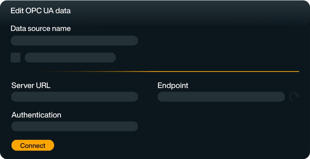
Connect your Excel files directly in Peakboard Designer — locally, via network drives or via cloud services such as Microsoft OneDrive, SharePoint, Google Drive or Dropbox. Select individual spreadsheets or specific cell areas that you want to visualize.
Tip: If your Excel spreadsheet is static, you can easily add it as a local resource in Peakboard Designer. If the data changes, you can connect your Excel spreadsheet dynamically, e.g. in a network drive, OneDrive or SharePoint.
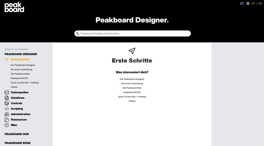
On our help site, you will find detailed instructions on Connect your Excel data.
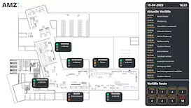
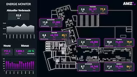
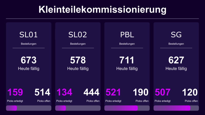
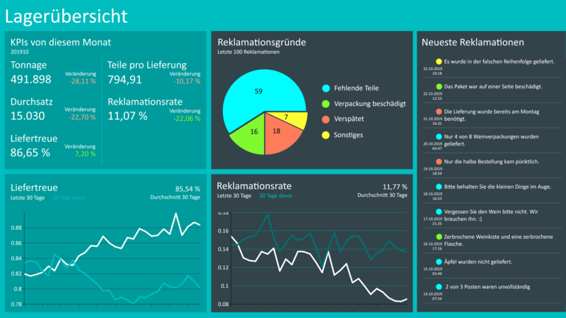
Use a variety of visualization elements such as charts, tables, and key figure fields to clearly present your data. Whether production figures, logistics data or other project figures — you keep an eye on all relevant information.
Interactive and dynamic
With conditional formatting, color codes and interactive elements, you can design your dashboards exactly as you need — individually and application-oriented.
Set smart rules that take effect automatically as soon as certain thresholds are exceeded or fallen below. For example, you can highlight critical values in color, display alerts, or send automatic notifications directly — e.g. to Microsoft Teams, via email, or other connected systems.
This not only visualizes your Excel data, but also becomes a real early warning system in everyday working life. Whether it's borderline areas in production, shortages in logistics or discrepancies in sales — with Peakboard, you can react faster and more specifically.
More than just Excel
Prepare your data in the integrated dataflow or combine it with data from other sources such as SQL databases, APIs, or IoT devices.
Start now for free with Peakboard Designer
Capture, process and visualize production and order data in real time — simply and without programming knowledge.


All of your data.
Peakboard connects your systems and brings all data to one platform — for visualization, automation and individual applications.


%201.svg)
%201.svg)


%201.svg)
%201.svg)


%201.svg)
%201.svg)


%201.svg)
%201.svg)


%201.svg)
%201.svg)


%201.svg)
%201.svg)


More information
for your start with Peakboard.
Save time with our templates
No time for long designs? No problem: Use one of the many ready-made templates for dashboards and applications — e.g. for production monitoring, warehouse management or quality assurance. Pick a template, customize it, and you're done.


