Fishbone Diagram: Structure, Categories and Use in Manufacturing
Structure, categories and approach for the fishbone diagram – with an example from manufacturing, the typical mistakes and the difference from 5 Whys and Pareto.
29.09.2026
·
5 min read
- A fishbone diagram sorts the possible causes of a problem into categories – it holds hypotheses, nothing is proven by it.
- The method goes back to Kaoru Ishikawa; the ASQ counts it among the seven basic quality tools but gives no year of origin.
- From four Ms to seven: Manpower, Machinery, Materials and Methods, extended by Measurement, Mother Nature and Money.
- The most consequential mistake happens after the diagram: no rating, no verification, no action.
- With interlinked causes the method reaches its limit – Pareto, a fault tree or a designed experiment take you further.
A fishbone diagram sorts the possible causes of a problem into categories and shows where in the process nobody has looked yet. It is one of the oldest tools in quality management and still one of the most useful ones on the shop floor – as long as an action comes out of it at the end.
What is a fishbone diagram?
The fishbone diagram, also called a cause-and-effect diagram or an Ishikawa diagram, goes back to the Japanese quality researcher Kaoru Ishikawa. The American Society for Quality still lists it among the seven basic quality tools and points out that Ishikawa first brought those seven tools together in his book Guide to Quality Control. The ASQ gives no year of origin, and the literature dates it differently.
The structure fits into one sentence: the problem sits at the head of the fish, the main categories branch off the spine, and the possible causes hang from those branches. That also points to the most important property of the method: a fishbone diagram holds hypotheses. Nothing is proven by it. It orders what the team considers possible. Which cause is actually at work is decided afterwards – with data, at the process, in a trial.
The categories: from four Ms to seven
The basis is four Ms: Manpower, Machinery, Materials and Methods. The American Society for Quality works with six core categories and adds Measurement and Mother Nature, the environment and everything around the process. Money follows as a seventh M, which the ASQ describes as less commonly included but useful for contemporary diagrams.
Which set is the right one is decided by the process. The example below and the Peakboard application on this page work with these six, labelled Manpower, Machine, Material, Method, Measurement and Environment. Leave measurement out and measuring errors quietly end up in other branches.
Six steps to the diagram
- State the problem clearly. Specific, measurable and without blame. “Shift B is doing a poor job” leads nowhere; “the line is not reaching its planned output per shift” describes what this is about.
- Choose the categories. Four, six or seven – whichever reflects the process.
- Gather the causes. With the people who run the process, and ideally where it runs. Gather first, discuss second.
- Ask one level deeper. For every cause on the board, ask at least once why it occurs. That is how sub-branches appear, and those are what you can work on.
- Look for the gaps. An almost empty branch means either that there is nothing there, or that nobody in the room knows that area. Both are worth knowing.
- Rate and verify. Mark the most likely causes and check them – with data from the equipment, by observation, with a targeted trial.
An example from manufacturing
The problem at the head of the fish: the production line is not reaching its planned output per shift. What can end up in the six branches:
- Manpower: operators are not sufficiently trained for the required takt time; staffing is too low during parts of the shift.
- Machine: recurring micro-stoppages; the equipment runs below its intended production speed.
- Material: material shortages interrupt the process.
- Method: the standard work sequence contains unnecessary handling steps; set-up and cleaning activities are not optimised.
- Measurement: short stoppages are not recorded consistently in the production data – on paper the line looks better than it runs.
- Environment: the workplace layout causes long walking distances; cramped space slows down material supply.
And typically: the most promising lead is rarely where the discussion starts.
Four mistakes that cost you the benefit
- Symptoms in the branches. “Too much scrap” is an effect. What belongs in the branches is whatever produces it.
- Names in the branches. As soon as individuals are named, the honest search for causes is over.
- No rating. A diagram with forty entries and no priorities is a collection of material. Nobody has analysed anything yet.
- No follow-up. When the same problem returns in three months, the team starts from scratch, because nobody knows what was already checked last time.
And one limit of the method is worth knowing: with complex problems and interlinked causes the fishbone quickly becomes crowded, and feedback between causes is something it cannot show. Pareto analysis, a fault tree or a designed experiment are the better tools then.
Fishbone, 5 Whys and Pareto: which does what?
- With the fishbone diagram the team gathers possible causes in breadth, across all categories.
- With 5 Whys it follows one cause into depth, down to the core. More on that in the article on the 5 Whys method.
- Pareto sets the priorities: which type of defect costs the most in frequency, time or money?
A sequence that works in the shop floor meeting: Pareto shows which problem is worth the effort, with the fishbone the team gathers the candidates, and with 5 Whys it digs at the most likely spot.
From diagram to action
Cause analysis is one step in a larger routine – in the PDCA cycle as much as in the 8D report, where it sits as a step of its own before the corrective and preventive actions. Three things decide whether anything comes of the analysis: a verified cause, an action with an owner and a due date, and an effectiveness check a few weeks later. Who does what by when belongs in the daily routine, for example on a shop floor team meeting board.
What is left after the meeting
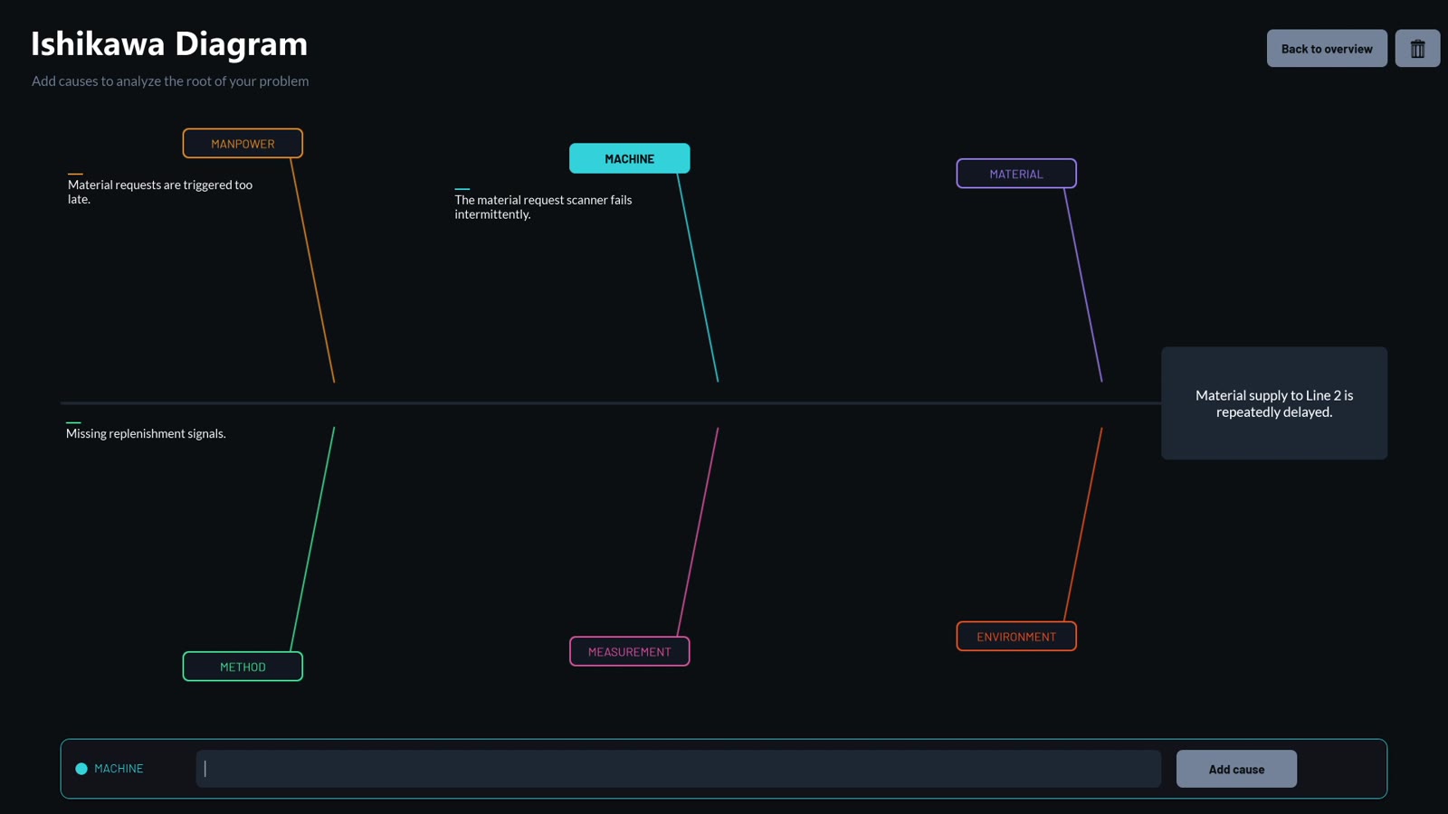
On a flip chart a good analysis takes twenty minutes – and afterwards disappears into a photo on somebody’s phone. A digital board changes two things about that: the analysis stays findable, and the next time the same problem appears it can be continued. What that looks like on the shop floor is shown by the interactive Ishikawa board: causes are entered on the display, assigned to the six categories and saved.
In the template, the problem statement and the causes are held in lists in the Peakboard Hub. Other data sources can be connected just as well, for example SQL, Oracle or ODBC.
The rest stays manual work in the best sense: go there, look, ask. The tool structures the discussion – leading it is the team’s job.
Free template
Fishbone diagram on the shop floor
With the interactive Ishikawa board from Peakboard the team gathers causes right on the display – assigned to the six categories and saved for later.

Frequently asked questions about the fishbone diagram
What is a fishbone diagram?
A fishbone diagram is a cause-and-effect diagram: the problem sits at the head of the fish, the possible causes hang from the branches, ordered into categories such as Manpower, Machinery, Materials and Methods. It structures the search for causes in the team and shows where nobody has looked yet.
Which categories belong in a fishbone diagram?
The basis is four Ms: Manpower, Machinery, Materials and Methods. The ASQ works with six core categories and adds Measurement and Mother Nature, with Money as a seventh. Which set fits is decided by the process.
How many causes should a diagram contain?
As many as the team can confirm or rule out. A branch with twenty entries that nobody checks is worth less than six causes with a clear rating.
When should I use 5 Whys instead of a fishbone diagram?
The fishbone diagram goes into breadth and gathers possible causes. The 5 Whys method goes into depth and follows a single cause down to its core. In practice the two are combined: gather first, then question the most likely cause.
Who should take part in the cause analysis?
The people who run the process every day: operators, setters, maintenance, quality. Without them you get a diagram about the shop floor in which the shop floor itself does not appear.
Fishbone diagram, Ishikawa diagram, cause-and-effect diagram – what is the difference?
They are the same tool. “Fishbone” describes the shape, “cause-and-effect diagram” the purpose, “Ishikawa” the originator. The ASQ uses all three names for it.