A guide to creating an enterprise template for Peakboard applications
Creating a Peakboard application is easy and straightforward. But as the scale grows, people from different parts of the organization usually get involved — from different departments and different locations. For that situation there are a few best practices and patterns worth following.
01.10.2024
·
2 min read

- An enterprise template enforces the corporate design company-wide.
- Colors, fonts, grids, and UI components are defined centrally, once.
- This lets even people without design skills create on-brand dashboards.
- The master screen serves as the starting point for all further applications.
This article describes how to create a company-wide Peakboard template that enforces the corporate design requirements and ensures that even people without design or marketing skills can create dashboards and applications that meet the company's needs. These steps have proven to be best practice in hundreds of customer projects.
Colors
Project colors store the colors used in the current application. Every new control is based on that color set. The background colors determine the overall impression — whether it is a light or a dark theme. The primary, highlight, and signal colors influence everything else and are typically taken from the corporate design requirements.

Fonts
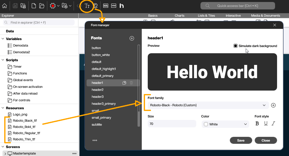
The corporate design guidelines usually specify one or two fonts to use. All font-related definitions for the various text styles (heading, button, standard, and so on) can be set in the corresponding dialog.
But what if your company's font is not available in Peakboard by default? In that case a custom font has to be added to the project as a resource (a TTF file). The TTF file is then transferred to the Peakboard Box as part of the project.
Creating the master screen
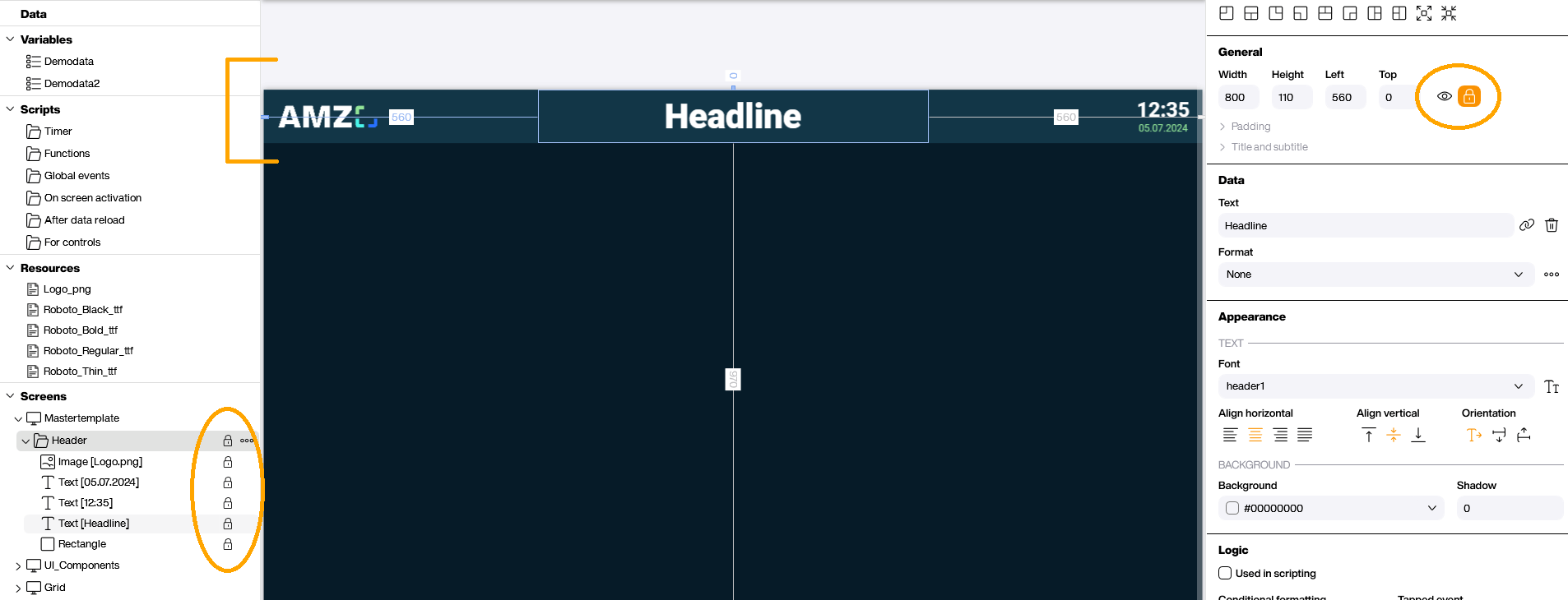
To create one or more master pages, first add the company logo as a resource and then build the actual template. A header with the logo and a text box showing the current time plus a headline is usually a good start.
Once that element is in place, group it, lock it, and click the lock icon. This prevents it from being changed by mistake.
If you don't want to create a new screen from scratch, right-click the template screen and select “Duplicate (locked controls only).” The new screen then contains only the template's locked controls.
UI components
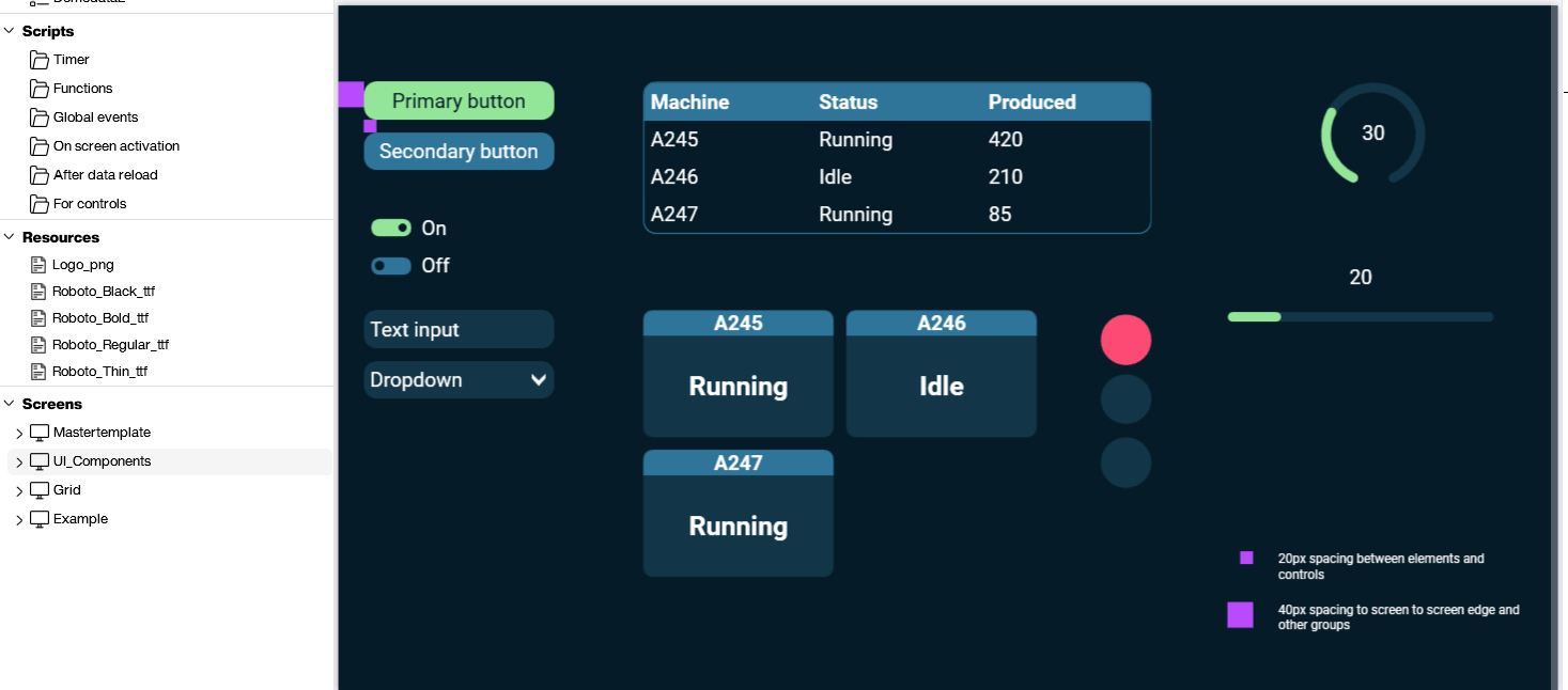
The UI components are defined mainly by the standard colors and fonts already covered. For further customization, UI control templates can be created on a separate screen, as the screenshot below shows.
The user can then pick a UI control from the template and copy and paste it onto the screen they're working on. The copied control brings all the required styles with it and is ready to use.
The template also provides guidance on correct placement. It shows spacings of 20px and 40px and explains when to use which. Further explanatory text and notes can of course be added as needed.
Grid
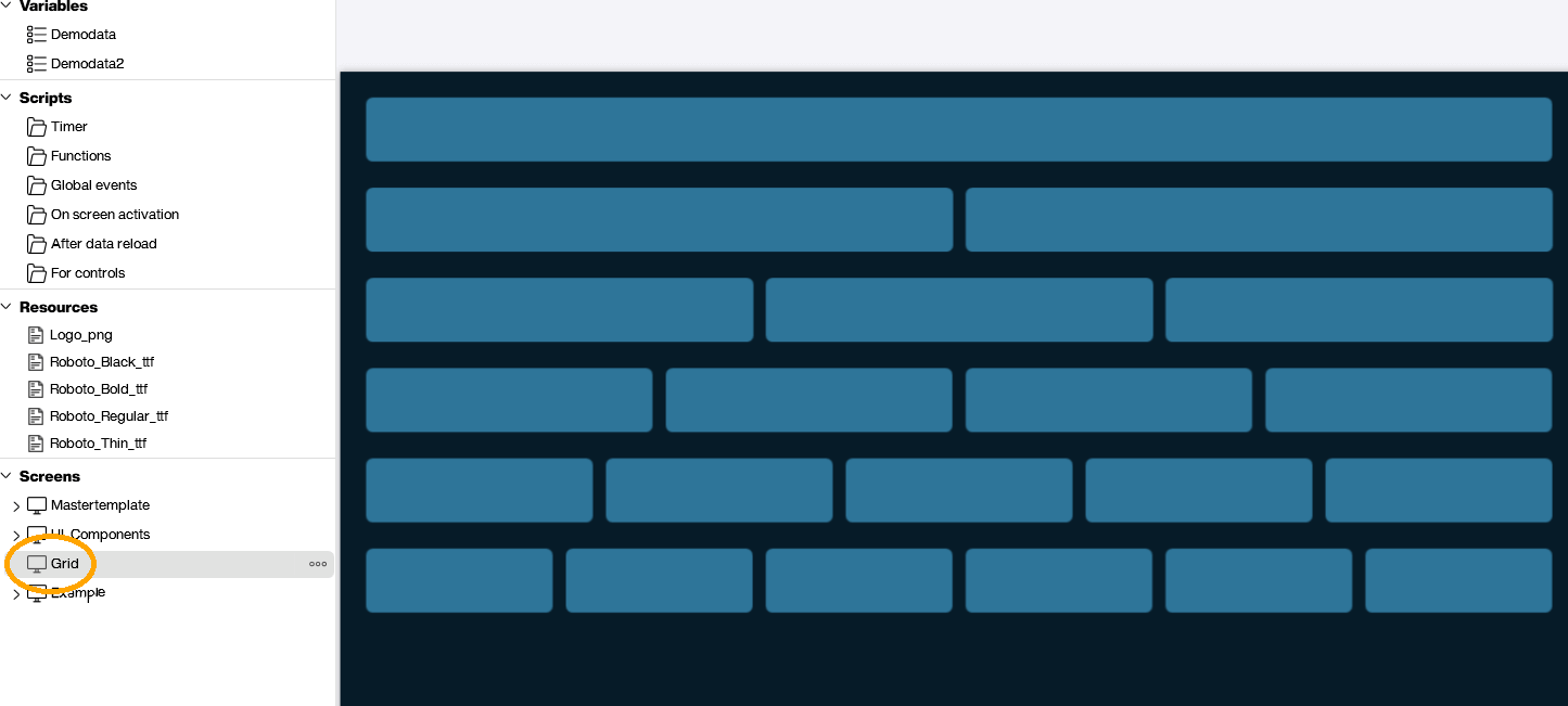
A common pattern is to group controls into defined areas. The following screenshot shows how to prepare those grid areas. The grid can be copied to a new screen, adjusted in height, and used straight away.
A grid like this makes the end result look more professional and gives the person using the board a sense of which controls belong together, which makes the whole board easier to use.
End result
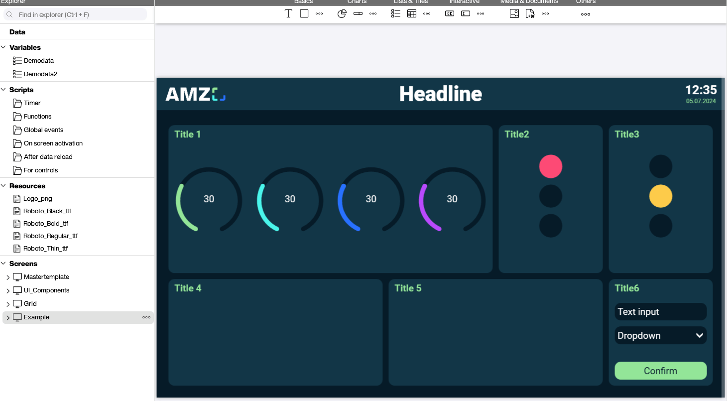
The screenshot below shows a screen using all the techniques discussed. Predefined colors and fonts were used, along with the master template and its headings. The UI controls were copied from the template and placed on a predefined grid.
Frequently asked questions about the enterprise template
What is an enterprise template in Peakboard for?
It enforces the corporate design guidelines company-wide and ensures that even people without design skills create on-brand dashboards.
What does the template define?
Central elements such as colors, fonts, grids, and UI components, plus a master screen as the starting point for new applications.
What benefit does it bring?
A consistent look across all dashboards, less coordination effort, and faster creation, because the design basis is already in place.