
The importance of icons in dashboard design
In data visualization and dashboard design, icons play a crucial role in improving the user experience and the comprehensibility of information. They can turn complex data into an intuitive interface that is easy to navigate. Here is a closer look at what icons mean for dashboard design and how they help make dashboards more efficient and easier to use.
12.09.2024
·
3 min read
- Icons don't just make dashboards prettier – they make them faster to understand.
- They replace text blocks, ease navigation, and support data comprehension.
- Consistent icons create recognition across multiple dashboards.
- They improve accessibility – including for color-vision deficiency.
Improving visual appeal
Icons give dashboards visual appeal and break up monotonous blocks of text and data. They make dashboards more attractive and aesthetically pleasing, which encourages users to interact with the data more often. A well-designed icon set can adapt to the overall theme and branding and provide a consistent look.
Improved usability and navigation
Icons serve as visual cues that guide users through the dashboard. They help users identify different sections, features, and actions quickly, without having to read lengthy descriptions. That is particularly useful in complex dashboards with several widgets and data points. A gear icon for settings or a magnifying glass for search, for example, are universally understood and reduce the training time for new users.
Tip: Choose understandable, universal icons. Make sure the icons you use are generally understood and can be interpreted universally. Simple, familiar symbols such as the gear icon for settings or a house to return to a home screen make the dashboard easier to use and reduce the need for extra explanation. Avoid symbols that are too abstract or too specific, as they can cause confusion.

Conveying information efficiently
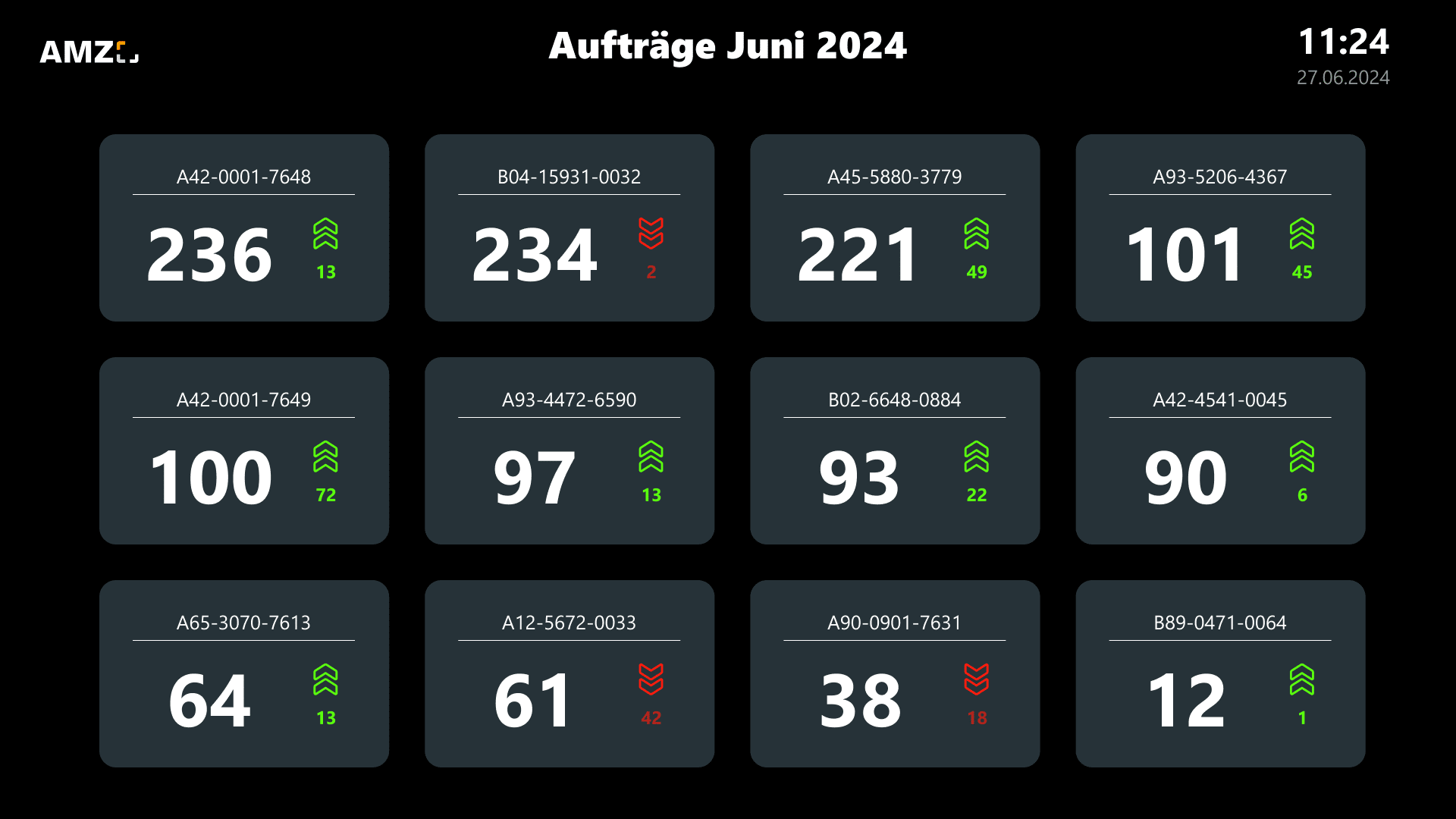
Icons can convey information concisely and make it easier for users to grasp data at a glance. On a dashboard, where space is often limited, icons can replace or supplement text to give a clear and immediate understanding of the data. A simple upward arrow can indicate a positive trend, for example, while a downward arrow signals a decline. This visual shorthand is invaluable for making quick decisions.
Supporting data understanding
Icons can highlight important key figures on dashboards and alert users to critical changes or anomalies. Colored icons — red for warnings, green for good performance — draw attention to key areas that may call for immediate action. This visual prioritization helps users focus on what matters and improves both data understanding and responsiveness.
Tip: Use icons and color sparingly and deliberately, to draw users' attention to the essential data points without overloading the dashboard.
Promoting accessibility
Icons can also improve the accessibility of dashboards. For users with reading difficulties, or those who do not speak the dashboard's main language fluently, icons offer a universal means of understanding. That inclusivity ensures a wider audience can benefit from the insights the dashboard provides.
Creating consistency
Consistency in icon design reinforces the overall structure of the dashboard and makes it easy for users to predict the behavior and function of different elements. Standardizing icons across all dashboards within an organization helps ensure a uniform user experience.
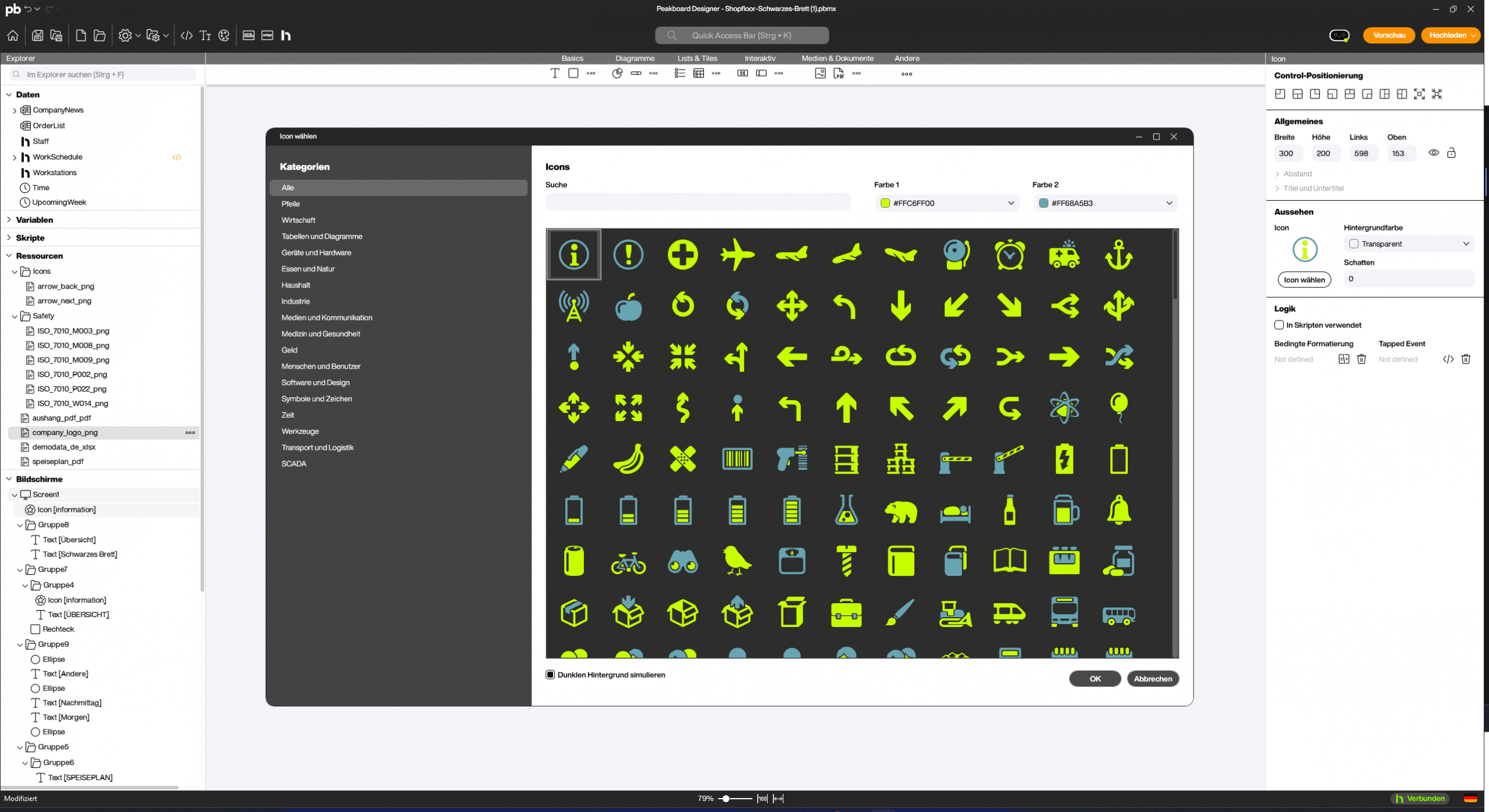
Tip: Use a consistent icon set that suits the theme of your dashboard. Make sure the icons harmonize in style, color, and size to create a coherent overall picture. In the Peakboard Designer you will find an icon set with 561 different icons whose colors you can adjust. And of course you can upload your own icons as .png.
By using icons deliberately you can significantly improve the usability, clarity, and appeal of your dashboard. Icons are not merely decorative elements but powerful tools for conveying data and aiding navigation, turning your dashboard into an effective instrument for data analysis and decision-making.
Frequently asked questions about icons in dashboard design
What are icons good for on a dashboard?
Icons convey information at a glance, break up monotonous text blocks, and ease navigation – which speeds up how fast data is grasped.
Do icons improve accessibility?
Yes. As an extra visual layer they help people with color-vision deficiency in particular to recognize status and meaning even without color.
What should I watch out for?
Consistency: a uniform style and the same meaning across all dashboards, so icons are reliably recognized.


