From Real-Time Data to a Live Dashboard in Less Than Two Days
When a company wants to connect various data sources, prepare the data sensibly and communicate it to the right recipients in real time, that often means lengthy, complex projects with significant intervention in the IT infrastructure. Yet information can be visualized after just one or two days of simple preparation, and used as the basis for improving business-critical processes.
01.05.2024
·
5 min read
- Real-time data can be turned into a dashboard in under two days.
- The most common problem: outdated, scattered data.
- The path: define goals and data, clean the data, design the visualization.
- Peakboard uses the existing IT infrastructure instead of replacing it.
Easy access to real-time data
At first, many companies do not know exactly how to start using their data in real time and shy away from the supposedly large financial and staffing costs. Yet there are solutions that supplement the existing IT infrastructure without months of meticulous planning and without setting aside large budgets for later changes. One to two days of preparation is usually enough to implement a working dashboard that shows you an up-to-date target/actual comparison. Within a short time you can, for example, minimize downtime, plan resources better, deploy staff more efficiently, or let employees see their own success.
The problem: data that is too old and often only available in scattered form
We all know it: before a product is finished it goes through several production steps that have to mesh smoothly. If something goes wrong during one of those steps, many companies react slowly because they receive the information too late — sometimes only the next day. That makes efficient intervention in running processes impossible, especially as managers and employees often have to log on to a computer first to get the information they need to improve the process.
It would be better if news of an important event were communicated automatically, at the moment it happens, to exactly the employees who need that information. Monitors in the production hall make precisely this possible: they display process-relevant information in real time and let you take action immediately, right where you are.
You can build such a real-time dashboard in just a few steps. Once learned, the process can easily be repeated whenever needed — when changed production methods call for new information, for example, or when your ideas about which data to show and how develop further.
Ideally, the departments themselves can quickly adapt their dashboards and design new ones without help from an external or internal third party. Changes then no longer touch the network integration, because all the work happens purely on the software interface of the visualization solution. The Peakboard Designer interface, for example, is intuitive to use even for people who do not work with it daily. But now to the specific steps for your real-time dashboard:
Step 1: Define your goals and select the data and recipients
As a rule, a very well-functioning dashboard can be developed in a two-hour workshop with everyone involved in the process. Alongside the network administrators, that includes the employees who will later read and interpret the information on the dashboard — the team on the line, for instance — and of course the department itself.
First determine what you want to achieve. Once the goals are defined, you decide which information should be used to reach them. These questions help: which information influences the process, and in what way? And: which actions can be derived from the information? After that you define which people should receive which data.
Tip: The wealth of available data sometimes tempts you to pack too much into a single visualization. Superfluous information stops you taking in the elements that really matter, because it quickly makes the dashboard cluttered. Regularly asking yourself what each piece of information actually contributes to the goal helps you stay focused.
Step 2: Select a visualization solution and clean up the data
The solution you finally choose should not only serve to achieve all the goals but ideally also spare your IT resources. Peakboard requires no external servers and meets the necessary security requirements by only caching the data and encrypting communication. Communication also takes place solely within the local network, so no data leaves the company. It is equally important that communication between the visualization solution and the network is limited to the data explicitly released for it.
Because IT infrastructures have often grown over the years, data is usually spread across an ever increasing number of sources. These range from Excel lists through machine controllers, sensors, and low-voltage signals to MES, production control systems, or SAP. The data these systems generate for their various status messages differs accordingly. To be able to display it intelligently later, you clean it up and bring it into a common logic.
In multi-stage production, identifying downtime is crucial. For that we at Peakboard work with the internal IT specialists: they know where the required data sits and what the corresponding error message looks like, because every system represents a message such as “machine stopped” differently. Once the error code is known, it is cleaned up — rewritten or freed of unnecessary information so that the visualization solution can recognize and process it.
Step 3: Design the visualization and implement the solution
The ideas you have gathered should finally be realized in a dashboard. It is important that the dashboard is not just nice to look at but above all conveys relevant information, so viewers can derive instructions for action from it. Use the whole space of your dashboard, but do not overfill it, as described above. The right amount of white space, alignment to a grid, and a legible typeface also make the dashboard look tidy and understandable. You will find more tips and tricks for designing a perfect visualization in our blog post “Dashboard design basics”.
Your finished visualization can now be mounted wherever it will be used. A dashboard intended for a single workplace should ideally hang at the viewer's eye level; a standard monitor is sufficient for that. A dashboard holding relevant information for the whole shop floor is best placed centrally and shown on a large screen, so the information can be read from a distance.
Conclusion
The dashboard creation process described here can be transferred to many different areas of a company. Show availability at shipping, create a welcome board for reception, or visualize real-time information about company-relevant data in controlling or management.
Between the wish for real-time data visualization and the reality of it there are usually three small steps, taking a maximum of two days. Bring everyone involved to the table and you will quickly arrive at a dashboard the whole team supports. Later on, the departments can adapt or optimize it for new circumstances themselves, entirely according to their needs — without having to get IT on board.
What does my finished dashboard look like?
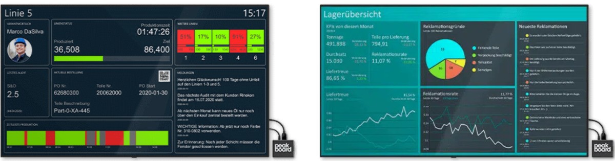
Whether it is a reception dashboard, a production dashboard, or a logistics dashboard — exactly what your finished dashboard looks like is up to you. Our templates show a few examples:
Frequently asked questions about using real-time data
How quickly can I get a real-time dashboard?
With the right approach, in less than two days. The prerequisite is that goals, data sources, and recipients are clearly defined in advance.
What is the biggest obstacle?
Usually the data is too old and scattered across different systems. That is why cleaning and consolidating the data is a central step.
Do I have to rebuild my IT for it?
No. Peakboard uses the existing IT infrastructure and connects to the data sources you already have instead of replacing them.